Subject:
|
Re: The Flame and The Lance
|
Newsgroups:
|
lugnet.space
|
Date:
|
Wed, 18 Jun 2003 04:16:11 GMT
|
Viewed:
|
2998 times
|
| |

|
|
In lugnet.space, Paul Hartzog wrote:
| |
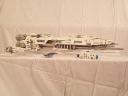
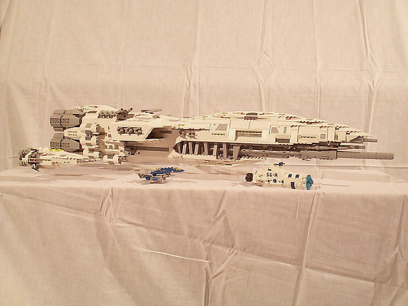
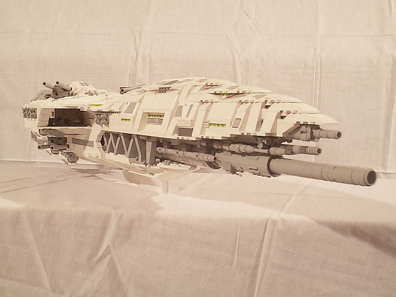
That pic really demonstrates the long gradual curves of the ship. Very nice.
Also, the white frames the grey in a really nice way. There is a
noticeable lack of exposed studs, another bonus. And the central gray struts
are angled in opposite directions which has the unique effect of making the
lighting on the moc look like a zigzag on those areas. Did you do this
deliberately or was it an aftereffect?
|
Mainly an aftereffect, but I knew that the alternating slopes would give a
distinctive impression anyway. Glad you pointed it out.
| |
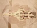
I set this pic as my desktop background. Again you can see the zigzag effect
from the lighting. So nice.
|
This is my favourite picture too. An action pic, but you can see a lot of the
ship too.
| |

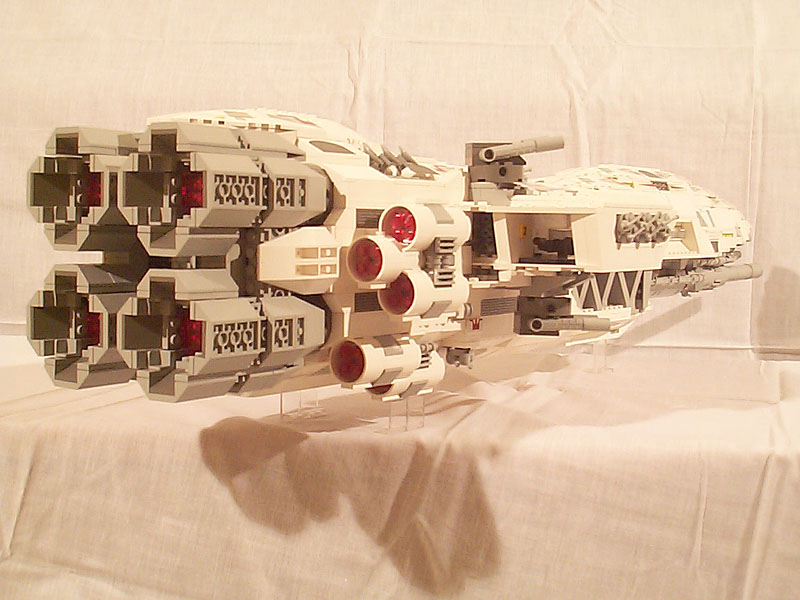
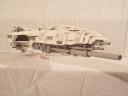
The engines have slopes inside of them used in a way that I really like, i.e.
dropping them into the 4x4 inverse slope pieces. Also, it never occured to me
to nest the 3x6 white engines on the sides like that. I always stack them,
not offset them. Go figger.
|
They don’t fit well, though... their curved part doesn’t line up nicely with
inverse slopes with conventional positioning.
| |
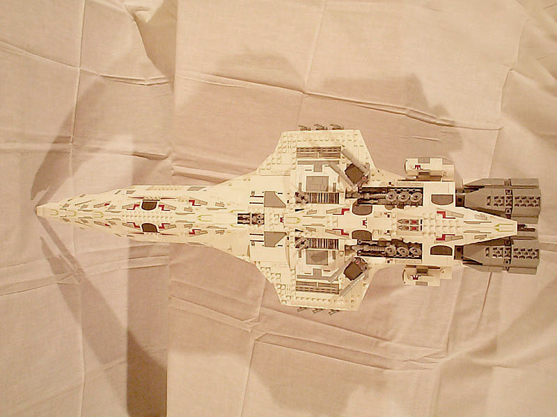
I like the symmetrical rows of mini radar dishes near the back and the
overall shape is excellent. You’d think that so many decorated pieces would
throw off the effect, but the whiteness is still fairly uniform. Excellent.
|
The stickers help this a lot. I don’t usually use stickers, but an abundace of
spare panels and stickers did the trick for the top of the Lance. They go
really well with just a modest greebled area.
| |
What are the decorated tiles in the center of that pic?
|
They’re just 2x2 tiles with a grille sticker from
Both these ships use a lot of stickers. They give the right detailing effect
for microscale, and I was fortunate to have a lot of certain pieces (and X-Wing
sticker sheets) so I was comfortable putting stickers on some of these parts.
Normally I wouldn’t do it, but IMO this was a good application.
| |
This is so nicely designed, I have to ask:
did you design it on paper first?
|
It’s ironic, really, I designed a lot of my ships on paper or even in CAD, but
this one was just straight out of inspiration. I just love that Jedi Starfighter
wedge slope. I knew what it was perfect for, and it just flowed out of that
piece.
Cheers,

|
|
Message is in Reply To:
 | | Re: The Flame and The Lance
|
| (...) (URL) That pic really demonstrates the long gradual curves of the ship. Very nice. Also, the white frames the grey in a really nice way. There is a noticeable lack of exposed studs, another bonus. And the central gray struts are angled in (...) (23 years ago, 17-Jun-03, to lugnet.space, FTX)
|
68 Messages in This Thread:


- Entire Thread on One Page:
- Nested:
All | Brief | Compact | Dots
Linear:
All | Brief | Compact
|
|
|
|