Subject:
|
Re: Argent Supra
|
Newsgroups:
|
lugnet.space
|
Date:
|
Tue, 17 Feb 2004 08:38:58 GMT
|
Viewed:
|
687 times
|
| |

|
|
In lugnet.space, Bram Lambrecht wrote:
| |
In lugnet.space, Paul Baulch wrote:
| |
My love affair with the 3x12 wedge slope continues:
|
That’s exactly what I thought when I first saw the pics on Brickshelf.
|
More 3x12 wedge sloped MOCs to come, by the way... ;-)
| |
| |
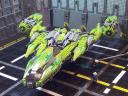
Argent
Supra
|
I like it, but... I think the printed slopes make it a little too busy. I
think the design would look more cohesive if some of the slopes were
Brassoed. For starters, I’d do one level of slopes on the front end, so the
pattern isn’t repeated with 2 bricks height, and I’d also remove the printing
on the inside leading edge of the wing. If that looks better, it might be
worth seeing how those bare slopes look at your engine exhausts. If the
larger expanses of color help define the shape better, maybe it’s worth it to
Brasso almost all of them.
|
I’m disagreeing with a few people here, but I don’t think that the printing
makes it look too busy. Indeed, it was something I considered while building it,
and in the end I decided that I preferred the detail level conferred, especially
in the way it added some extra silver details to an already-partly-silver MOC.
It’s a purely aesthetic issue, I guess. I tend to dislike large expanses of
featureless plastic, something I noticed with another MOC I’m currently working
on, which uses a large number of unprinted red 3x12 wedges together... and they
prevent a lot of detail arrangement that I would otherwise prefer. I don’t know,
maybe you’ll like that MOC better!
| |
Besides that, the shape looks very fast, and I love your engine details and
use of chrome. The interior looks quite comfortable, and the loading ramp is
a nice touch. The backdrop is excellent, a fantastic improvement over the
white sheet! :)
|
Completion of the backdrop held up photography by a couple of weeks too. But it
was worth it. :-)
Cheers,

|
|
Message is in Reply To:
 | | Re: Argent Supra
|
| (...) That's exactly what I thought when I first saw the pics on Brickshelf. (...) I like it, but... I think the printed slopes make it a little too busy. I think the design would look more cohesive if some of the slopes were Brassoed. For starters, (...) (20 years ago, 16-Feb-04, to lugnet.space, FTX)
|
36 Messages in This Thread:


- Entire Thread on One Page:
- Nested:
All | Brief | Compact | Dots
Linear:
All | Brief | Compact
|
|
|
|
