Subject:
|
Re: a few new things
|
Newsgroups:
|
lugnet.admin.general
|
Date:
|
Thu, 6 Jun 2002 03:59:42 GMT
|
Viewed:
|
2342 times
|
| |

|
|
"LUGNET Admin" <suz@lugnet.com> wrote in message
news:Gx9574.qt@lugnet.com...
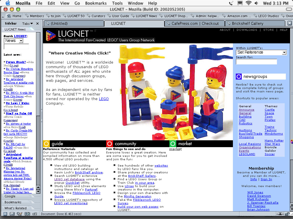
> The new homepage is in progress.. Only its basic layout is decided. Choice • of
> exact text, pretty pictures and links are yet to be hammered out. you're
> looking at placeholders..
> http://www.baseplate.com/lugnet/work/screen-1.jpg
> currently I'm wondering:
> do people really need a button to click when they initiate a search? or • is
> everyone like me and just hit Return? how many cool tools can I launch • from the
> homepage? should I really use CSS? how small can I make that type.. how • often
> can I realisticly update pretty content about the community? where can I • stick
> a 'latest posts' box, like we used to have? should I mention that we now • have
> members of 100 flags? (all 50 states, DC, and about 49? countries)... • blah,
> blah, blah...
The following are just my opinions, so don't be too offended by them...
I think that the new home page suffers from the same problem as the the old
home page, it's too busy and it doesn't convey what the important parts of
the site are.
I'll start at the left. I'm really not sure what that left column is. Is
it part of the page? I'm not familiar with the Mac anymore, and don't use
mozilla. It looks to me like part of the browser rather then part of the
web page. Apparently it is to replace the "Top Stories" section of the old
page? And it scrolls seperately from the rest of the page?
Are the poster name and the group name really necessary? I'd leave it like
it currently is, with just the messege topic listed. I'd also keep the
name. "Top Stories" sounds much better then "Latest News". I'd have say 10
messages at most. And i'd put the search on the bottom. A go button for
the search would be a good idea. I'm not personally a fan of the drop down
box, so i'd make it a "search news" only type of thing, since you have a set
search on the other side of the page.
Center pane, top: I like the picture :) Nice clean design. I'd add your
blurb about the breadth of member ship here after the LEGO disclaimer.
Center pane, bottom: Again, too cluttered. I also don't think it is a very
good idea to have so many external links on the home page. It invites
people to hop out of your site too quickly. You want to keep them at your
site. The links should be available, but not on the home page.
Right pane: I like that you suggest people view the entire list of forums,
but you should probably provide a direct link to it. I would probably call
them Forums rather then Newsgroups. I find myself having to explain quite
often what newsgroups are to people who have never heard of usenet.
I'm a big fan of simplicity and ease of use. And I think that you should
also promote the assets of Lugnet over external ones more on the home page.
How I would do it:
I'd get rid of the entire left pane completely.
I'd keep the top of the center pane as is.
I'd keep the three headings from the bottom, but would change what comes
under them:
Under Guide I would have:
"Find a Set" with a search box and go button that would search the set
database. This could have "Or use our quickset utility" under it.
"Find a Part" with a search box and go button that would search the partref
database.
"Find Instructions" with a search box and go button that would take them to
the correct page at Brickshelf for the instructions they are looking for.
You'd have to work out with Kevin if this was OK or not.
A link to "more resources" which would take people to a "Guide Page" which
would have perhap more advanced search boxes / explainations as well as
links to all of the other available resources.
In my opinion, this will greatly simplify the choices for new users. It
also puts the emphasis on internal LUGNET content over external content.
Nothing against Brickshelf, but it should not be the first link.
Under Community I would:
Change the order of things a bit, again to emphasize the internal stuff.
I'd move the "build your own web pages" up to the top. This is a good
feature (although one that I have not explored) that Lugnet offers. I'm
assuming that the "websites" link will be to the LUGNET listing of websites,
so that is good on the top. I would then have the Brickshelf link and then
a link to more resources as above, this time taking them to a "Community
Page" with links to other community type things.
Under Market:
I'm not sure what you have planned for here. Is this going to be some sort
of LUGNET hosted marketplace, or links to other places? Will we see a
Bricklink.com link here? Brickwise? Retailers?
In the right pane I would have:
Top Stories at the top, with at most 10, with the news search box under it.
Forums under that, with a link to the full forum list, and the shortcuts to
specific groups.
The membership info under that.
I think this gives the Forums prominent placing, and the forums are one of
the main assets of LUGNET.
Well, I think tha tis enough babbling from me for now. Hopefully you find
some of the suggestions useful. If you have any questions of me, or neen me
to clarify anything, just let me know.
Troy
(who will probably post agian tomorrow touching on your magazine idea)
|
|
Message is in Reply To:
 | | a few new things
|
| hi. for those of you who love progress... I have a few things to reveal that are not ready for "real" announcement yet. I'm open to feedback as I work. (I know how you guys *love* to provide feedback.. wink) I started an Admin Help Wanted list: (...) (24 years ago, 5-Jun-02, to lugnet.admin.general)
|
20 Messages in This Thread:


- Entire Thread on One Page:
- Nested:
All | Brief | Compact | Dots
Linear:
All | Brief | Compact
|
|
|
|