Subject:
|
Re: Opinions sought on rendering method
|
Newsgroups:
|
lugnet.cad.ray
|
Date:
|
Mon, 8 Oct 2007 14:12:59 GMT
|
Viewed:
|
12627 times
|
| |

|
|
In lugnet.cad.ray, Philippe Hurbain wrote:
| |
For me, the keypoint here is “for instructions”. Anything that remove
legibility to the image should be avoided.
|
| |
Version 2
- shadow makes the image more complex. To be avoided in instructions!
|
I agree with Philo that the shadows are distracting. I don’t think the stud
logos are necessary, either.
On the other hand, I think the transparent parts in the first rendering look a
little too dark.
There’s also a grainy texture under some of the transparent parts. For example,
the interior of the cone on the antenna.
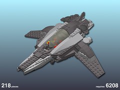
While we’re at it, I’d love to invite criticism of my very similar experiment
with instruction-style rendering (click “All Sizes” for a bigger version):

Problems I’ve noticed with my rendering:
- edge tracing quirks - see the note on the image
- no edges under canopy - that windscreen has given me a lot of rendering grief
As noted here, I’ve used some of your
tools and tips, Travis.
Jim
|
|
Message has 1 Reply:
Message is in Reply To:
 | | Re: Opinions sought on rendering method
|
| (...) For me, the keypoint here is "for instructions". Anything that remove legibility to the image should be avoided. In both versions conditional lines are not rendered. Not a huge problem here, could become one on models with many rounded (...) (19 years ago, 8-Oct-07, to lugnet.cad.ray, FTX)
|
22 Messages in This Thread:


- Entire Thread on One Page:
- Nested:
All | Brief | Compact | Dots
Linear:
All | Brief | Compact
This Message and its Replies on One Page:
- Nested:
All | Brief | Compact | Dots
Linear:
All | Brief | Compact
|
|
|
|