Subject:
|
Re: Opinions sought on rendering method
|
Newsgroups:
|
lugnet.cad.ray
|
Date:
|
Mon, 8 Oct 2007 15:38:24 GMT
|
Viewed:
|
12562 times
|
| |

|
|
In lugnet.cad.ray, Philippe Hurbain wrote:
| |
In lugnet.cad.ray, Travis Cobbs wrote:
| |
I’m working on a different rendering method (for instructions) using
POV-Ray, and I wanted to get some opinions about the output.(snip)
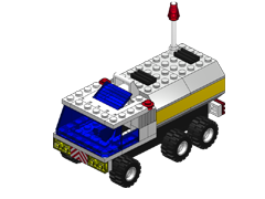
Version 1:

1600x1200
800x600
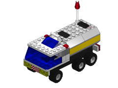
Version 2:

1600x1200
800x600
|
For me, the keypoint here is “for instructions”. Anything that remove
legibility to the image should be avoided.
In both versions
- conditional lines are not rendered. Not a huge problem here, could become one on models with many rounded surfaces.
- Black is too dark/uniform. Lighter edgelines?
- The complex transparency effect in the rounded edge of the windscreen is nice but brings nothing to legibility
Version 2
- shadow makes the image more complex. To be avoided in instructions!
- No details in tires (the shiny look of V1 is not realistic, but clearer)
- reflections of studs on bricks also makes the image less understandable
The clear winner for me is version 1.
Silly question - why don’t you use LDView???
|
Good point. I think the official instructions are harder to follow
now with the fancy rendering. Sometimes you can’t tell one color
from another, especially black, white, and the various shades of gray.
I can barely tell the white bricks from the gray ones in your pics.
And what’s up with the light spot on the gray slopes on the back. Is
it supposed to be chrome? Otherwise that just confuses me. Go with
the simplest lighting possible for instructions. I think a lot of
ambient light and just a hint of direct light keeps the colors distinct
and gives enough 3D hints to discern shapes. Forget about spotlights
unless you’re rendering metallic parts, and even then try and render
them with their own lighting if possible. Clarity is more important
than realism. Trust me, nothing discourages my kids (and me) more than
going back 20 steps to replace a dark gray part with the correct light
gray part.
Also, if you can make the translucent bricks slightly opaque like
Jim’s example, I think it makes the insides less confusing. Your
yellow headlights look almost inside out.
As an example the rendering
here is much, much
less realistic, but I think it’s easier to follow than the instructions with
too much realism.
Have fun,
Don
|
|
Message has 1 Reply:
Message is in Reply To:
 | | Re: Opinions sought on rendering method
|
| (...) For me, the keypoint here is "for instructions". Anything that remove legibility to the image should be avoided. In both versions conditional lines are not rendered. Not a huge problem here, could become one on models with many rounded (...) (19 years ago, 8-Oct-07, to lugnet.cad.ray, FTX)
|
22 Messages in This Thread:


- Entire Thread on One Page:
- Nested:
All | Brief | Compact | Dots
Linear:
All | Brief | Compact
This Message and its Replies on One Page:
- Nested:
All | Brief | Compact | Dots
Linear:
All | Brief | Compact
|
|
|
|