Subject:
|
Re: Snub Fighter.
|
Newsgroups:
|
lugnet.space
|
Date:
|
Wed, 9 Jul 2003 15:35:29 GMT
|
Viewed:
|
1931 times
|
| |

|
|
In lugnet.space, Mark Sandlin wrote:
| |
In lugnet.announce.moc, Allister McLaren wrote:
| |
Hi all,
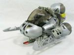
I would like to present this small fighter for your viewing pleasure.

|
Hi Allister,
I really do like the shape of this. It’s very compact and whooshable.
However, something about it just doesn’t work for me. I think it might be
that the colors beneath the bionicle parts are too varied. You have the
silver bionicle bits on top, yet underneath you have light gray, dark gray,
blue, and black all mixed together. I also think the exposed technic bits on
the outer “wings” take away from the overall look.
I would suggest making all the subsurface colors dark gray, with maybe a
single highlight color here and there.
Overall, it’s a good MOC, but I think with just a bit of refinement it could
be an awesome MOC.
|
Damn you Mark. I was going to bed before I read this. Now, well, have a look at
these. new pic 1
new pic 2
new pic 3
I swapped in as much dark grey as I could and got rid of the random colours. I
don’t know what I was thinking with the blue and black bits. All I can say is it
was late, o so very late, and I’ve been adversly affected by building Star Wars
sets.
You were also right about the technic bits on the wings, but I couldn’t see a
better way to do it. I decided to think of them as greebling. But since you
brought it up I had another crack at it. Once again phuematic hoses came to my
rescue and it looks a lot cleaner now, although they are a little less secure.
As I replied to Adrian, I decided against the highlight colour. Nice idea, but
impractical in this case I think. Besides if you check out the rest of my
Brickshelf folder you’ll
see this is about the greyest thing I’ve made so far. Everyone needs at least
one all grey model ;)
Cheers and thanks for the feedback. I hope the revised version works better for
you.
Allister
|
|
Message is in Reply To:
 | | Re: Snub Fighter.
|
| (...) Hi Allister, I really do like the shape of this. It's very compact and whooshable. However, something about it just doesn't work for me. I think it might be that the colors beneath the bionicle parts are too varied. You have the silver (...) (23 years ago, 9-Jul-03, to lugnet.space, FTX)
|
18 Messages in This Thread:


- Entire Thread on One Page:
- Nested:
All | Brief | Compact | Dots
Linear:
All | Brief | Compact
|
|
|
|