| |
Hi all,
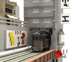
Recently I was looking through the CSF stampunk inspirations galleries and found
this picture. I thought this
was pretty cool since it combined a train, some town and some pipes. Rather than
using it for inspiration, I decided to mimic it, with a coupld of changes to
make my life easier. Anyway, enough story, here

BS gallery
Please let me know what you think, criticism is more than acceptable.
Tim
|
|
Message has 5 Replies:
 | | Re: Steampunk diorama
|
| (...) The billboard is a bit weak but everything else rawks! It would be cool if we could get coppery colored elements... (20 years ago, 15-Dec-05, to lugnet.space, FTX)
|  | | Re: Steampunk diorama
|
| (...) Very nice theme crossover creation. I like all the pipes and whatnots. Good color selections too. Jonathan (20 years ago, 15-Dec-05, to lugnet.space, FTX)
|  | | Re: Steampunk diorama
|
| (...) That's a pretty decent rendition, although I think there's too much gray. Also, that sign on top with the chinese character looks a bit weak. I've done some (URL) kanji signage> myself, and I would have probably done only the bottom half of (...) (20 years ago, 15-Dec-05, to lugnet.space, FTX)
|  | | Re: Steampunk diorama
|
| Excellent job. Contrary to other opinions, the billboard is really great in my opinion. But here's where I take issue with this... You clearly spent some time putting that model together, but it doesn't look like you spent nearly enough time (...) (20 years ago, 16-Dec-05, to lugnet.space, FTX)
|  | | Re: Steampunk diorama
|
| With Tim's permission, I made some high quality renders of this scene. They are available here: (URL) Enjoy> (20 years ago, 19-Dec-05, to lugnet.space, FTX)
|
15 Messages in This Thread:


- Entire Thread on One Page:
- Nested:
All | Brief | Compact | Dots
Linear:
All | Brief | Compact
|
|
|
|