Subject:
|
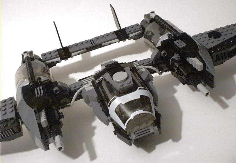
sPace3800 - P38 contest entry
|
Newsgroups:
|
lugnet.space
|
Date:
|
Wed, 3 Mar 2004 01:59:42 GMT
|
Highlighted:
|
!
(details)
|
Viewed:
|
2240 times
|
| |

|
|

Click the pic to view the rest.
--SteveR
|
|
Message has 6 Replies:
 | | Re: sPace3800 - P38 contest entry
|
| (...) Wow, I really liked your entry. I like how you built the engine pods and used the LOM canopy. One thing it could use is a way to "round-off" the front of the canopy. Maybe a 4x4 half-sphere or 4x4 radar dish or something. It just looks a (...) (22 years ago, 3-Mar-04, to lugnet.space, FTX)
|  | | Re: sPace3800 - P38 contest entry
|
| Very sinister, Steve. The snub-nosed cockpit adds to that effect; it's got a bat-like quality. Way to integrate those Kraata containers too. That Wehrmachtsgrau works well on this one. Peace and sinisterness(1), Professor Whateverly (URL) (...) (22 years ago, 4-Mar-04, to lugnet.space, FTX)
|  | | Re: sPace3800 - P38 contest entry
|
| "Steve Runnels" <steve@livethenow.com> wrote in message news:Htz9JI.39I@lugnet.com... (...) (URL) (...) Short and stubby, almost like a flying wing--very original! P38 is a cool design, but I've been looking forward to the creations that stretch (...) (22 years ago, 15-Mar-04, to lugnet.space)
|  | | Re: sPace3800 - P38 contest entry
|
| (...) I really like this. The color scheme and almost-blocky shape makes it look particularly vicious. The Slug cans are a nice touch, though it seems like they would look better with a bit more greebly stuff inside, between the chrome domes and the (...) (22 years ago, 17-Mar-04, to lugnet.space, FTX)
|
8 Messages in This Thread:


- Entire Thread on One Page:
- Nested:
All | Brief | Compact | Dots
Linear:
All | Brief | Compact
|
|
|
|