| |
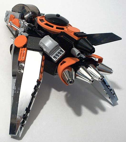
This is just a random fighter of unspecified origin. Colors are orange, black,
chrome, and new grey (mdstone). Lots of crazy SNOT on this thing. I may get a
few disassembled shots later.

As usual, click the pic for the rest, post-mod.
Or they can be seen here, pre-mod:
http://www.asphodel.org/bsv/?path=SteveR/Desolator
--SteveR
|
|
Message has 5 Replies:
 | | Re: Desolator - Space Fighter
|
| (...) That's some wonderful multi-vectored love you have there. And that is a really good way to mount the controls off of the canopy. You also picked my favorite pic for this post. This has a lot of colors on it. Maybe too many. But I think in the (...) (21 years ago, 13-Mar-04, to lugnet.space, FTX)
|  | | Re: Desolator - Space Fighter
|
| (...) Woah! Really shocking and nice. Very creative model- the use of chrome is very cool, (wish I had chrome) and the bionicle parts used in the back is unique. I like it. Really swift and deadly-looking. Only thing I don't like is the area around (...) (21 years ago, 15-Mar-04, to lugnet.space, FTX)
|  | | Re: Desolator - Space Fighter
|
| (...) That's a pretty cool colour scheme. The gray wedge plates on either side of the cockpit seem to disrupt the sleek lines, though. Are they covering something, or could they be left off? Cheers, (URL) Sci-Fi LEGO> (21 years ago, 18-Mar-04, to lugnet.space, FTX)
|  | | Re: Desolator - Space Fighter
|
| (...) Steve, your design for this ship is way rad. I love the unusual angles that you achieved, which are complemented by your interesting color choices. To be honest, I think it could have been a little more unified if you'd used black or grey in (...) (21 years ago, 18-Mar-04, to lugnet.space, FTX)
|
7 Messages in This Thread:


- Entire Thread on One Page:
- Nested:
All | Brief | Compact | Dots
Linear:
All | Brief | Compact
|
|
|
|