| |
from the Kind of Subpar
teasie weesie:
http://www.brickshelf.com/gallery/glencaer/ProvincialRipoff/fg1.jpg
http://www.brickshelf.com/gallery/glencaer/ProvincialRipoff/ff1.jpg
and the folder of love:
http://www.brickshelf.com/cgi-bin/gallery.cgi?f=41624
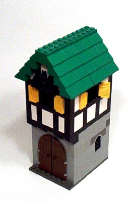
* i had to destroy two of the earlier Provincials for these two, so i'll be
unable to do a 'group shot' without engaging in the photoshop of magical power.
* these all are inspired by jon furman's creations, but unlike him, i don't
have any sand green or sand blue bricks, so i can't really do the subtle colors
that he has. oh well, i like these all the same.
* the green roofed one is a medieval dentist, and the blue one is a printer
(seeing as the time period is ~1600 and gutenburg (sp) made his little
invention in the 1500's.. i think.. oh well, it's a press either way).
and for anyone interested in giving feedback here's a little survey. just "x"
the one that fits best.
======
I thought...
[ ] this MOC was the best I've ever seen, I would sell my house to own it.
[ ] this MOC looks juvenile and silly, I'd rather be hit with tomatoes than
look at this MOC.
The color scheme...
[ ] was masterful, the touch of a true genius
[ ] sophomoric and painful, I'd rather be tortured by a gang of mad goats than
look at those ugly colors.
The General design...
[ ] was purely inspired by the hand of God himself.
[ ] truly elaborates on what i was saying yesterday, that Lenny is a no-talent
bum who hangs around Lugnet because he has nothing better to do with his like.
The details (dentist, press)...
[ ] Amazingly portray the intentions of the modern day LEGO master, their
creativity and complexity will astound for generations to come.
[ ] Make me want to puke.
Thanks for taking the time to fill my survey, now I can really gauge how people
feel about my MOCs.
;o)
|
|
Message has 3 Replies:
 | | Re: More Subpar MOCs
|
| (...) SNIP (...) [x]both are smaller than the provincials, which i think better reflects the much lower standard of living for the times. And cute! (...) [x] basic is good (...) [x] they both nicely reflect castle town tudor style (...) [x] Dentist: (...) (23 years ago, 29-Apr-03, to lugnet.castle)
| | | Re: More Subpar MOCs
|
| Hi Lenny! (...) so much? (...) I like them too. You are doing a good job in this style, very nice. (...) and not only is it a press, but a color press as well! :) Seriously, I like your press. Hadn't thought of making one before, your looks good. I (...) (23 years ago, 29-Apr-03, to lugnet.castle)
| | | Re: More Subpar MOCs
|
| Hi, very nice buildings ! just the right size to fit in a moc-castle. Other Buildings take to much bricks and have not the right proportions to the castles and towers. Do you have instructions or *.dat files ? But wait...wow...the peasant hut you (...) (23 years ago, 7-May-03, to lugnet.castle)
|
4 Messages in This Thread:


- Entire Thread on One Page:
- Nested:
All | Brief | Compact | Dots
Linear:
All | Brief | Compact
|
|
|
|
