| |
In lugnet.build.mosaic, Sonnich Jensen wrote:
| |
Updated.
If anyone would add some more letters, especially other non-English letters,
I’d be happy.
|
I’d leave the old ‘M’ in as an alternative. Also the ‘W’ done the same way, but
upside down. A ‘T’ done this way only takes up three vertical plates, rather
than six.
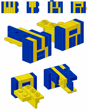
Doing 4-stud-high lettering, I found that you only had to change the design of
one or two letters to make the whole think look like a different style. It’s
useful to have some alternatives, not just in style but to alter the width of
the final text.
Now, I have a solution for ‘K’ and ‘R’, but it’s complicated to model. It uses
the tip of a 1x2-1x4 bracket as a half-thickness plate. This allows you to
build a 1-stud-square pattern, so the top half of your letter can be a different
orientation to the bottom half.
It’s more difficult to lock in place, and you have to watch for stray studs at
the top, bottom or ends. You can just wedge it in place against the opposite
wall though.
You’re unlikely to be able to use it in a 4-wide body, but a 6-wide body can use
the technique on opposite sides so long as you don’t have a ‘K’ or ‘R’ exactly
opposite each other. If that’s a problem, you can add a SNOT logo to one end of
the text, to offset it a little.

You can also alter whether you use the half-plate-thick bracket as your
lettering colour, or use it as a spacer in the background colour and only have
whole plate thicknesses for lettering. But, this may cause you more problems in
aligning the studs, or building around the hidden part of the bracket.
Jason Railton
|
|
Message is in Reply To:
11 Messages in This Thread:


- Entire Thread on One Page:
- Nested:
All | Brief | Compact | Dots
Linear:
All | Brief | Compact
|
|
|
|