| |
In lugnet.announce, Didier Enjary wrote:
| |
http://photos.freelug.org/main.php/v/6studs/docs/SB/SBv1.pdf.html
(click “Télécharger document” , pdf document - 1,7Mb )
Well, almost everything is said in the document introduction.
Since I’ve discovered the community 4 years ago, I feel the need for a
compilation of building techniques. More recently, reading various
forums/articles (among them classic-castle, mechahub, and excellent posts by
Linus Bohman on classic-space) I feel again the need for such a document.
The fact is that I wrote this some months ago and I felt then the document was
not complete. The reason I release it today is that I did not work on it since
then for various reasons. So I feel I should share it now.
Such a document obviously (TLC is releasing new parts leading to new
techniques every year) can’t be exhaustive and would need numerous updates.
|
Didier - congratulations on putting this together. It’s a very useful resource.
My apologies to the Brick-Wiki-Fiddlers, but I much prefer a well-written
document like this to inter-linked pages. BrickWiki may be useful as a
reference, but a well-structured straight-through read captures my interest much
more.
I like the tenth-offset model displayed there - I didn’t have access to as many
1x1 technic bricks when I did mine, so it’s good to see it updated.
I’ll try to find the graphics of my 4-stud high letters that went into the Brick
Issue for you. Only one of them was actually published - I do have a second,
thicker font.
I’ve not seen all the 2-high SNOT lettering collected together before. That is
very useful. I’ve used an ‘R’ with an offset right-leg myself, to distinguish
it from the ‘A’. I’ve noticed it used at Legoland Windsor too. I see you’ve
also included it for the letter ‘K’. Adding another 1x1 plate bottom-right to
the ‘O’ makes for a good ‘Q’ too.
To distinguish between ‘Y’ and ‘V’, you can use what you’ve listed as ‘4’ for a
‘Y’ (and optionally include a line at the bottom, like the lower case ‘y’ but
moved up).
There are some simpler alternatives for ‘L’ and ‘T’ and ‘S’, which just use two
or three vertical plates. They don’t need the regular columns of 1x1 plates and
so may be easier to fit in.
The ‘L’ is a vertical 1x2 plate with a 1x1 plate bottom-right. The ‘T’ is a
vertical 1x2 plate with a 1x1 plate top-left and top-right. The ‘S’ is a
vertical plate with a 1x1 plate bottom-left and top-right.
In this way, it is possible to do several characters using just vertical plates.
The other technique I use with this is to alternate colours of adjacent letters,
so you don’t need spaces between them. This is how I fit SNOT lettering onto
4x8 containters:
I’ve managed to fit ‘NBLTC’, ‘GWLTC’ and ‘SNOT’ (in sand green) on the sides of
containers in this way.
Finally, there is a regular method to construct these characters. On each stack
of 5 plates forming a column, make the bottom two 1x2 plates pointing away from
you, and the top three 1x1 plates. At the back, first fit a 1x1 technic brick
with the holes facing to the sides. Then, on the next whole column, fit one of
the new 1x1 bricks with studs on two sides. Keep alternating these two options
along the line of text, wherever there is a column of 5 plates. Then, using
vertical plates and tiles, you can join everything together with the SNOT pieces
in-between.
The one thing that will break up a chain of letters is a single vertical tile in
the centre of a letter. That is why I prefer my simpler version of ‘T’, and a
vertical line (with a space either side) for ‘I’.
Jason R
|
|
| |
In lugnet.build.schleim, Jason J Railton wrote:
| |
In lugnet.announce, Didier Enjary wrote:
| |
http://photos.freelug.org/main.php/v/6studs/docs/SB/SBv1.pdf.html
(click “Télécharger document” , pdf document - 1,7Mb )
|
|
SNIP
| |
Didier - congratulations on putting this together. It’s a very useful
resource.
|
Thank you Jason,
| |
I’ll try to find the graphics of my 4-stud high letters that went into the
Brick Issue for you. Only one of them was actually published - I do have a
second, thicker font.
I’ve not seen all the 2-high SNOT lettering collected together before. That
is very useful. I’ve used an ‘R’ with an offset right-leg myself, to
distinguish it from the ‘A’. I’ve noticed it used at Legoland Windsor too.
|
It seem LL Designers are really into making letterings those days - I’ve seen a
lot on BS pictures from LLCA.
| |
I see you’ve also included it for the letter ‘K’. Adding another 1x1 plate
bottom-right to the ‘O’ makes for a good ‘Q’ too.
To distinguish between ‘Y’ and ‘V’, you can use what you’ve listed as ‘4’ for
a ‘Y’ (and optionally include a line at the bottom, like the lower case ‘y’
but moved up).
There are some simpler alternatives for ‘L’ and ‘T’ and ‘S’, which just use
two or three vertical plates. They don’t need the regular columns of 1x1
plates and so may be easier to fit in.
The ‘L’ is a vertical 1x2 plate with a 1x1 plate bottom-right. The ‘T’ is a
vertical 1x2 plate with a 1x1 plate top-left and top-right. The ‘S’ is a
vertical plate with a 1x1 plate bottom-left and top-right.
In this way, it is possible to do several characters using just vertical
plates.
The other technique I use with this is to alternate colours of adjacent
letters, so you don’t need spaces between them. This is how I fit SNOT
lettering onto 4x8 containters:
I’ve managed to fit ‘NBLTC’, ‘GWLTC’ and ‘SNOT’ (in sand green) on the sides
of containers in this way.
Finally, there is a regular method to construct these characters. On each
stack of 5 plates forming a column, make the bottom two 1x2 plates pointing
away from you, and the top three 1x1 plates. At the back, first fit a 1x1
technic brick with the holes facing to the sides. Then, on the next whole
column, fit one of the new 1x1 bricks with studs on two sides. Keep
alternating these two options along the line of text, wherever there is a
column of 5 plates. Then, using vertical plates and tiles, you can join
everything together with the SNOT pieces in-between.
The one thing that will break up a chain of letters is a single vertical tile
in the centre of a letter. That is why I prefer my simpler version of ‘T’,
and a vertical line (with a space either side) for ‘I’.
|
The construction of these characters is really difficult and your regular method
is now of interest as the 1x1 brick with two studs is more widely available. I’d
like to find another way to fix the single vertical line chain breaker problem
because your L,S and T present large bars. I also like your alternate colors
trick because it follows the spirit of more details in less space by cheating
the eye.
Thanks,
Didier
|
|
| |
In lugnet.build.schleim, Didier Enjary wrote:
| |
The construction of these characters is really difficult and your regular
method is now of interest as the 1x1 brick with two studs is more widely
available. I’d like to find another way to fix the single vertical line chain
breaker problem because your L,S and T present large bars. I also like your
alternate colors trick because it follows the spirit of more details in less
space by cheating the eye.
|
Oh yes, I didn’t mean they look better, just that they’re simpler. It just
means I can do the British train mark ‘L.M.S.’ using only vertical plates, so I
can fit it on a smaller engine than this one!
It can look better if you make the vertical lines two plates thick, because then
they balance out the horizontal bars. But, you can only do this with some
letters.
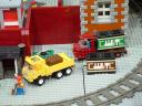
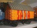
You may notice that the wagon in the background uses a yellow “J” in the
vertical style (forgot to mention that letter) with a red drop-shadow to the
bottom right. The whole thing is done in a 1-stud wide wall too.
Unfortunately, the alphabet for this style consists of one letter - “J” - lucky
for me!
The other thing I like about vertical letters is that you can add a shadow to
the right quite easily:
This is actually a very useful technique if you only have a few small plates in
your background colour. Most of the space is filled with the shadow colour
instead.
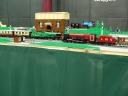
Of course, lettering tiles is a fairly quick way to do things too. The white
stripes on the blue engine is the hard way of doing things though.
Other schleimers might like to take a look at the split 2/3 plate SNOT on the
front of the brown carriage. See my article here:
http://www.brickish.org/bi/bi9.pdf
Jason R
|
|
| |
In lugnet.build.schleim, Jason J Railton wrote:
| |
Other schleimers might like to take a look at the split 2/3 plate SNOT on the
front of the brown carriage. See my article here:
http://www.brickish.org/bi/bi9.pdf
|
Let me correct that: http://www.brickish.org/bi/bi9.pdf
The technique uses two plates on one side
of a brick, and three plates on the other.
Here are my 4-stud-vertical fonts, including all the alternatives that were cut
from the Brick Issue
#3 article. I’ve added numbers too:
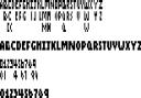
I’ve provided the thin type, with some alternative character renderings. These
let you do rounder or thinner characters, depending on your preferred style and
available space.
Below them are my thicker characters, mostly made by adding 1x4 plates. These
give clearer text and often let you join one side of the SNOT lettering on a
truck through to the other side with a 4x4 or 4x6 plate.
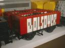
Compare the thin and thick text styles on these two wagons:
Also, don’t think I’m cheating by adding a line to the font sample on the ‘E’
and ‘3’ characters. If you use 1x1 plates at the top (instead of a vertical 1x2
plate), the seam can enhance how readable the character is (again, see the dark
red wagon above).
If you go up a directory from the font, you’ll also see a ridiculously
complicated ‘K’ and ‘R’ design using the half-plate thickness of a 1x2-1x4
bracket. Honestly, it’s not worth going this far...
Jason R
|
|
|