| |
hey all,
i'm looking for hopefully some sort of referance on making realistic looking
letters in a small size. i'm not looking for anything crazy but around/under 10
plates high would work. if you have anywhere you can point me it would be very
helpfull.
thanks,
ondrew
|
|
| |
In lugnet.build.mosaic, Ondrew Hartigan wrote:
> hey all,
> i'm looking for hopefully some sort of referance on making realistic looking
> letters in a small size. i'm not looking for anything crazy but around/under 10
> plates high would work. if you have anywhere you can point me it would be very
> helpfull.
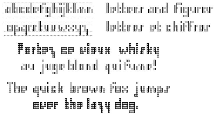
Good place to start: http://www.ericharshbarger.org/lego/fonts.html
ROSCO
|
|
| |
In lugnet.build.mosaic, Ondrew Hartigan wrote:
| |
hey all,
i’m looking for hopefully some sort of referance on making realistic looking
letters in a small size. i’m not looking for anything crazy but around/under
10 plates high would work. if you have anywhere you can point me it would be
very helpfull.
thanks,
ondrew
|
Hi Ondrew,
I’ve added for you a kind of compilation of all 5 plates high SNOT letterings
you can see on BrickShelf :
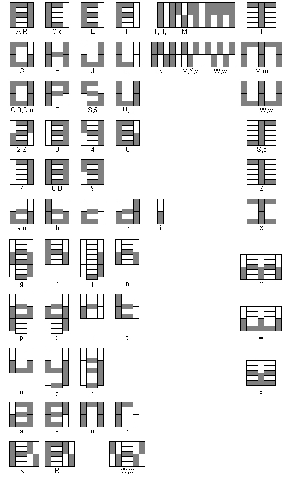
These kind of lettering is highly represented in minilands (see the LL
California pictures in lego-designer BS gallery) and recently misterzumbi
presents us a very nice (WOW - hi swami) Maersk lettering :
http://www.brickshelf.com/cgi-bin/gallery.cgi?f=161015
SNOT is not easy. You can prefer a Stud Out approach. Unfortunately, less than
10 plates high letters lead to an almost unreadable lettering :
You can also read this article
http://www.freelug.org/article.php3?id_article=391 about lettering with
further links.
Hope that helps.
Didier
|
|
| |
In lugnet.build.mosaic, Ondrew Hartigan wrote:
> hey all,
> i'm looking for hopefully some sort of referance on making realistic looking
> letters in a small size. i'm not looking for anything crazy but around/under 10
> plates high would work. if you have anywhere you can point me it would be very
> helpfull.
> thanks,
> ondrew
Hi!
I once asked the same question, and based on the replies I made this:
http://www.brickshelf.com/cgi-bin/gallery.cgi?i=703789
Keep in mind, that even that some one the letters are not that "real", the text
does still read, as the human mind compensates for for that. Especially when
there is enough to make sence, then one single a bit wierd letter does not make
that much interference.
I was once working on making a Russian version too, but that was never finished.
Upon request I might finish it, there is probably no need for that.
Sonnich
|
|
| |
--SNIP--
> I was once working on making a Russian version too, but that was never finished.
> Upon request I might finish it, there is probably no need for that.
>
> Sonnich
I will make that request. I may never use it but I'd love to see it done.
Tim
|
|
| |
In lugnet.build.mosaic, Timothy Gould wrote:
> --SNIP--
> > I was once working on making a Russian version too, but that was never finished.
> > Upon request I might finish it, there is probably no need for that.
> >
> > Sonnich
>
> I will make that request. I may never use it but I'd love to see it done.
>
> Tim
...and I second the request
Didier
|
|
| |
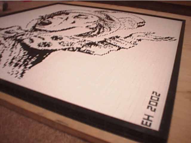
A smaller font can also be made for some of the letters of the alphabet
similar to the "EH 2002" in this fuzzy picture:
http://www.ericharshbarger.org/lego/images/mad_hatter/hatter_11.jpg
alas, I've never gotten around to documenting the letters on my LEGO
Fonts page.
eric
Ross Crawford wrote:
> In lugnet.build.mosaic, Ondrew Hartigan wrote:
>
> > hey all,
> > i'm looking for hopefully some sort of referance on making realistic looking
> > letters in a small size. i'm not looking for anything crazy but around/under 10
> > plates high would work. if you have anywhere you can point me it would be very
> > helpfull.
>
>
> Good place to start: http://www.ericharshbarger.org/lego/fonts.html
>
> ROSCO
|
|
| |
In lugnet.build.mosaic, Ondrew Hartigan wrote:
> hey all,
> i'm looking for hopefully some sort of referance on making realistic looking
> letters in a small size. i'm not looking for anything crazy but around/under 10
> plates high would work. if you have anywhere you can point me it would be very
> helpfull.
> thanks,
> ondrew
Well I don't think this is what you are looking for but here is an Alphabet I
came up with when designing the LOGO for NELUG.
http://www.bluecaboose.com/gallery/album01
http://www.nelug.org/
-Eric
|
|
| |
In lugnet.build.mosaic, Ondrew Hartigan wrote:
> hey all,
> i'm looking for hopefully some sort of referance on making realistic looking
> letters in a small size. i'm not looking for anything crazy but around/under 10
> plates high would work. if you have anywhere you can point me it would be very
> helpfull.
> thanks,
> ondrew
Ondrew,
It's not what you asked for, but it's what I use for small lettering..... the
real thing (found in Bricklink as individual letters).
On Clark Stephen's excellent website:
http://www.isodomos.com/VPH/Print0
These 1x1 letter and number bricks were produced from 1958 to 1972. What a pity
that TLG doesn't reintroduce these.
Gary Istok
|
|
| |
In lugnet.build.mosaic, Ondrew Hartigan wrote:
> hey all,
> i'm looking for hopefully some sort of referance on making realistic looking
> letters in a small size. i'm not looking for anything crazy but around/under 10
> plates high would work. if you have anywhere you can point me it would be very
> helpfull.
> thanks,
> ondrew
WOW guys i didin't expect so many awsome responces but i'll take what i can get.
=) the info provided is exactly what i needed and it will save me tons of time
when i go to put adversments on the sides of buildings.
thank you,
ondrew
p.s. can someone sticky this on the lugnet.build.mosaic page. i think plenty of
people will find it usefull.
|
|
|