 | | | | | | |
| |

|
In lugnet.build.mosaic, Jason J. Railton wrote:
> In lugnet.build.mosaic, Sonnich Jensen wrote:
> > Hi all!
> >
> > Thanks for the help, it was very useful. I have made what I needed, and got the
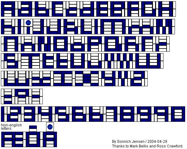
> > idea to add a font to those available - mine is smaller:
> > http://www.brickshelf.com/gallery/sonnich/gallery/alfabet_2high.jpg
> > I have even added symbols for: - = degrees.
> > This font is 2 bricks high (including a tile below).
> >
> > I and still missing some good ideas for the letters: K X Z - it is the odd lines
> > which makes it hard to do.
> > My r's are ok, but I'd like to have a capital R there too - it is the same
> > problem, an odd line.
> >
> > It anyone have any ideas, please let me know so I can add them.
> >
> > If anyone wants to host the final picture, let me know too.
> >
> > BR
> > Sonnich
> >
> > In lugnet.build.mosaic, Sonnich Jensen wrote:
> > > Hi all!
> > >
> > > Being new to this, and after trying, I realised that mosaics are not that easy
> > > to do.
> > > To be specific I want to have a text in a wall. I tought that it would be
> > > simple, but now I realise that it will take some more time.
> > >
> > > I am not even sure whether "mosaic" is the right term here.
> > >
> > > This has been done lots of times, but are there any tips or pages or ideas for
> > > beginners like me?
> > >
> > > BR
> > > Sonnich
> > > http://www.hot.ee/sonnich/lego/
>
> You beat me to it! I put something like this together last weekend, but haven't
> had the chance to photograph it!
>
> Jason Railton
You may use it if you want. I can send you the BMP file if you want (much easier
to edit). Mail me in interested!
Still, I am looking for solutions for the 4 missing letters.
I was playing around with non-english letters, got some, and was thinking of
Russian too.
Sonnich
| | | | | | | | | | | | | | | |
| |
|
> > In lugnet.build.mosaic, Sonnich Jensen wrote:
> > > I and still missing some good ideas for the letters: K X Z - it is the odd lines
> > > which makes it hard to do.
> > > My r's are ok, but I'd like to have a capital R there too - it is the same
> > > problem, an odd line.
> > >
> > > It anyone have any ideas, please let me know so I can add them.
> ...
> Still, I am looking for solutions for the 4 missing letters.
> ...
> Sonnich
There is a capital R and a small k in my hopper wagon:
http://www.brickshelf.com/gallery/mbellis/Trains/Wagons/railtrack_hopper_kid_2004.jpg
I would do a Z like a 2 as people will still be able to read it.
An smaller M would be like a W upside down with the two top corners filled in,
with the advantage that it's only 5 vertical plates wide. An N would be four
pairs of vertical plates, with both, top, bottom, both in the letter colour for
the four respective columns.
A small x might be two columns of 5 horizontal plates with the middle and bottom
ones in letter colour, with vertical plates in between, the bottom one in letter
colour. That would make it like two small cs back to back.
Mark Bellis
| | | | | | | | | | | | | | | | | |
| |
|
In lugnet.build.mosaic, Mark Bellis wrote:
> > > In lugnet.build.mosaic, Sonnich Jensen wrote:
> > > > I and still missing some good ideas for the letters: K X Z - it is the odd lines
> > > > which makes it hard to do.
> > > > My r's are ok, but I'd like to have a capital R there too - it is the same
> > > > problem, an odd line.
> > > >
> > > > It anyone have any ideas, please let me know so I can add them.
> > ...
> > Still, I am looking for solutions for the 4 missing letters.
> > ...
> > Sonnich
>
> There is a capital R and a small k in my hopper wagon:
> http://www.brickshelf.com/gallery/mbellis/Trains/Wagons/railtrack_hopper_kid_2004.jpg
>
> I would do a Z like a 2 as people will still be able to read it.
> An smaller M would be like a W upside down with the two top corners filled in,
> with the advantage that it's only 5 vertical plates wide. An N would be four
> pairs of vertical plates, with both, top, bottom, both in the letter colour for
> the four respective columns.
> A small x might be two columns of 5 horizontal plates with the middle and bottom
> ones in letter colour, with vertical plates in between, the bottom one in letter
> colour. That would make it like two small cs back to back.
>
> Mark Bellis
I have added the letters you mention, and the T in your car (slightly different
from mine)
http://www.brickshelf.com/cgi-bin/gallery.cgi?i=703789
I played a little around with the X.
The M and N are great.
The K and Z, partly R too are hard to read, a colleaque here could not figure it
out.
PLMKWYT
I'd also like to have more non-English letters in this. So far I only have æ, õ
and å (the to last can also be used for ñ and other letters with a ring above).
Letters like ö ä and ü would be similar, but I have no idea how to create them.
BR
Sonnich
http://www.hot.ee/sonnich/lego/
| | | | | | | | | | | | | | | | | |
| |
|
In lugnet.build.mosaic, Sonnich Jensen wrote:
> In lugnet.build.mosaic, Mark Bellis wrote:
> > > > In lugnet.build.mosaic, Sonnich Jensen wrote:
> > > > > I and still missing some good ideas for the letters: K X Z - it is the odd lines
> > > > > which makes it hard to do.
> > > > > My r's are ok, but I'd like to have a capital R there too - it is the same
> > > > > problem, an odd line.
> > > > >
> > > > > It anyone have any ideas, please let me know so I can add them.
> > > ...
> > > Still, I am looking for solutions for the 4 missing letters.
> > > ...
> > > Sonnich
> >
> > There is a capital R and a small k in my hopper wagon:
> > http://www.brickshelf.com/gallery/mbellis/Trains/Wagons/railtrack_hopper_kid_2004.jpg
> >
> > I would do a Z like a 2 as people will still be able to read it.
> > An smaller M would be like a W upside down with the two top corners filled in,
> > with the advantage that it's only 5 vertical plates wide. An N would be four
> > pairs of vertical plates, with both, top, bottom, both in the letter colour for
> > the four respective columns.
> > A small x might be two columns of 5 horizontal plates with the middle and bottom
> > ones in letter colour, with vertical plates in between, the bottom one in letter
> > colour. That would make it like two small cs back to back.
> >
> > Mark Bellis
>
> I have added the letters you mention, and the T in your car (slightly different
> from mine)
> http://www.brickshelf.com/cgi-bin/gallery.cgi?i=703789
>
> I played a little around with the X.
> The M and N are great.
> The K and Z, partly R too are hard to read, a colleaque here could not figure it
> out.
>
> PLMKWYT
>
> BR
> Sonnich
> http://www.hot.ee/sonnich/lego/
For the M I meant that the middle top plate would be in background colour.
As for reading, there should be no difficulty reading "Railtrack" on my hopper,
so it's the context in the word that matters. If a person knows what a word
should say, the brain fills in the rest. This was shown in scientific
experiments that words with letters in the wrong order were still read
correctly, so a couple of imperfectly shaped letters would be no worse than
reading handwriting!
Mark
| | | | | | | | | | | | | | | | | |
| |
|
In lugnet.build.mosaic, Mark Bellis wrote:
> In lugnet.build.mosaic, Sonnich Jensen wrote:
{snip}
> > I have added the letters you mention, and the T in your car (slightly different
> > from mine)
> > http://www.brickshelf.com/cgi-bin/gallery.cgi?i=703789
> >
> > I played a little around with the X.
> > The M and N are great.
> > The K and Z, partly R too are hard to read, a colleaque here could not figure it
> > out.
> >
> > PLMKWYT
> >
> > BR
> > Sonnich
> > http://www.hot.ee/sonnich/lego/
>
> For the M I meant that the middle top plate would be in background colour.
>
> As for reading, there should be no difficulty reading "Railtrack" on my hopper,
> so it's the context in the word that matters. If a person knows what a word
> should say, the brain fills in the rest. This was shown in scientific
> experiments that words with letters in the wrong order were still read
> correctly, so a couple of imperfectly shaped letters would be no worse than
> reading handwriting!
Updated.
If anyone would add some more letters, especially other non-English letters, I'd
be happy.
BR
Sonnich
| | | | | | | | | | | | | | | | |
In lugnet.build.mosaic, Sonnich Jensen wrote:
| |
Updated.
If anyone would add some more letters, especially other non-English letters,
I’d be happy.
|
I’d leave the old ‘M’ in as an alternative. Also the ‘W’ done the same way, but
upside down. A ‘T’ done this way only takes up three vertical plates, rather
than six.
Doing 4-stud-high lettering, I found that you only had to change the design of
one or two letters to make the whole think look like a different style. It’s
useful to have some alternatives, not just in style but to alter the width of
the final text.
Now, I have a solution for ‘K’ and ‘R’, but it’s complicated to model. It uses
the tip of a 1x2-1x4 bracket as a half-thickness plate. This allows you to
build a 1-stud-square pattern, so the top half of your letter can be a different
orientation to the bottom half.
It’s more difficult to lock in place, and you have to watch for stray studs at
the top, bottom or ends. You can just wedge it in place against the opposite
wall though.
You’re unlikely to be able to use it in a 4-wide body, but a 6-wide body can use
the technique on opposite sides so long as you don’t have a ‘K’ or ‘R’ exactly
opposite each other. If that’s a problem, you can add a SNOT logo to one end of
the text, to offset it a little.
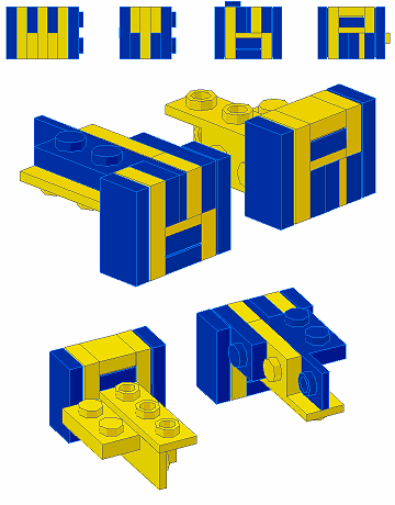
You can also alter whether you use the half-plate-thick bracket as your
lettering colour, or use it as a spacer in the background colour and only have
whole plate thicknesses for lettering. But, this may cause you more problems in
aligning the studs, or building around the hidden part of the bracket.
Jason Railton
| | | | | | |